Zeron's interface, measured
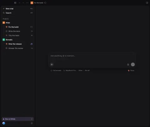
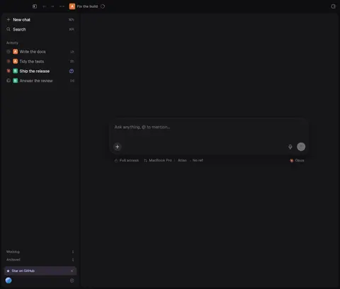
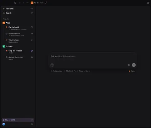
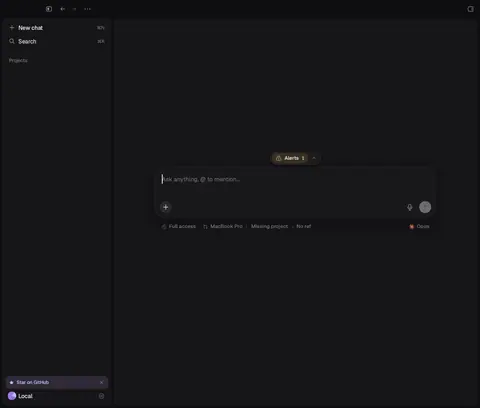
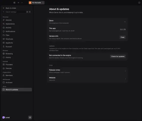
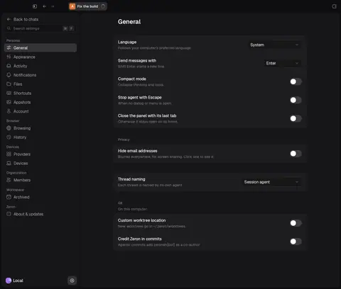
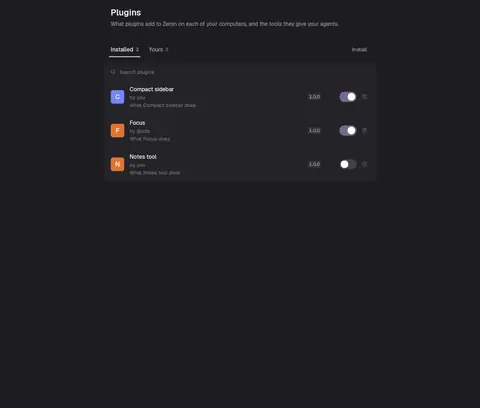
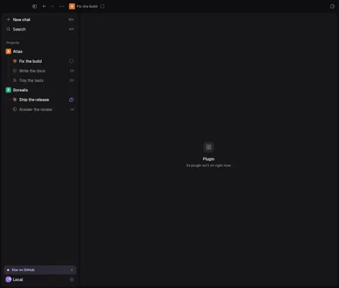
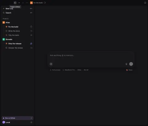
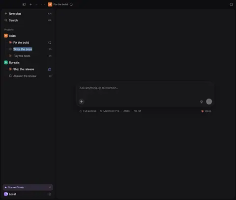
Every screen below was captured from Zeron's own UI fixtures (no account, no engine, made-up data), measured from the zgx layout tree (zgx inspect tree boxes, in points), and checked against the design tokens in ds/themes/zeron-*.json and ds/tokens.luau. Each screen page shows the dark, normal-width capture with the problems drawn on it — boxes, dashed guide lines and numbered pins — next to the numbered list; light, narrow and frosted variants are linked under it.
The app looks calm at a glance; up close it doesn't hold a grid. The same component shows up with different heights, insets and glyph sizes from screen to screen, the composer doesn't line up with the column it belongs to, and the spacing, icon and control tokens are bypassed with raw numbers. Issues marked "(measured)" come straight from the tree analysis; the rest were written by hand from the captures and the numbers.
Systemic problems
- 1high
17 button heights, and the 32 pt control token is almost unused
Across the 88 primary captures, buttons measure 17, 19, 20, 22, 24, 26, 28, 30, 32, 36, 40, 41, 46, 56, 60, 68 and 84 pt. The most common are 24 (537), 30 (471) and 28 (272); only 50 are 32 pt, the theme's
control.height. In source,$control.heightis referenced once; 33 distinct raw numbers are passed ash =(241 uses).Fix: Define a control scale (24 compact, 28 default, 32 large) as tokens, map every button/select/field/segmented to it, lint raw
h =numbers.ds/button.luau · ds/select.luau · ds/segmented.luau · ds/text_field.luau · ds/tokens.luau - 2high
Three ways to draw a keyboard shortcut
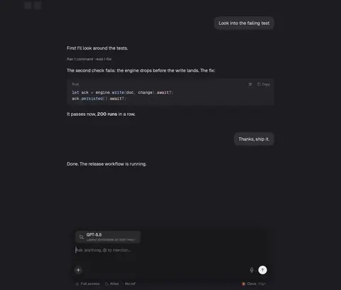
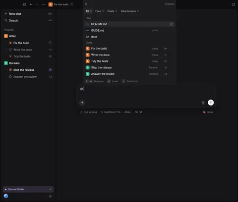
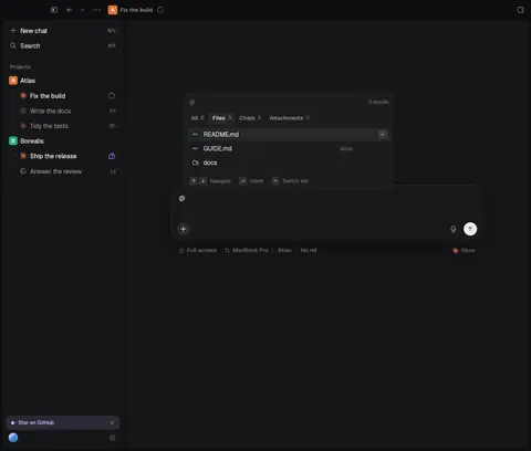
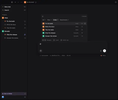
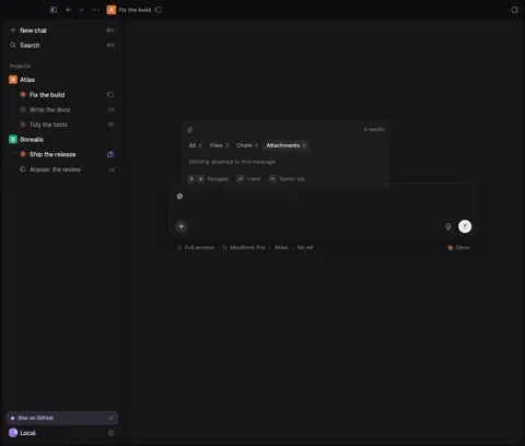
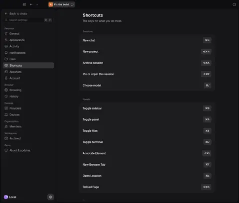
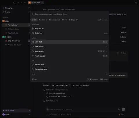
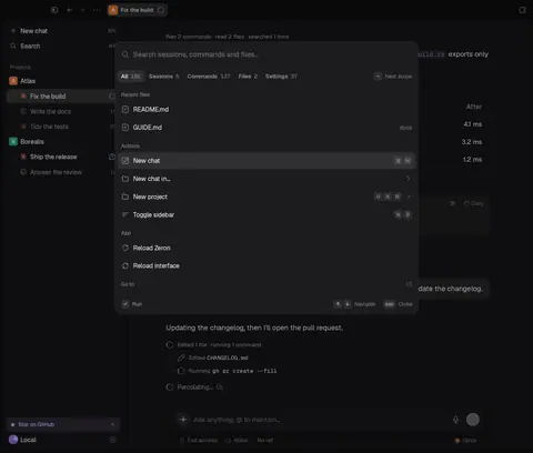
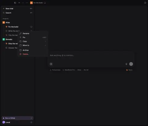
Plain glyph text in the sidebar ('⌘N', 11 pt), one cap per key in the palette, @ launcher and settings search (18 pt caps), a single pill in context menus ('⇧⌘P' 28×20), 20 pt single caps in panel home, and variable-width pills on the Shortcuts page.
Fix: One
Kbdrendering (text in menus/sidebars, caps only in hint footers) with one size.ds/kbd.luau and its callers - 3high
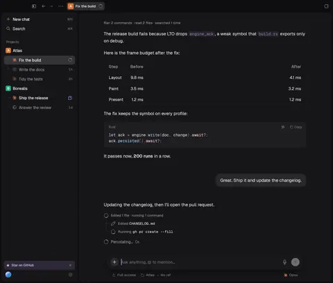
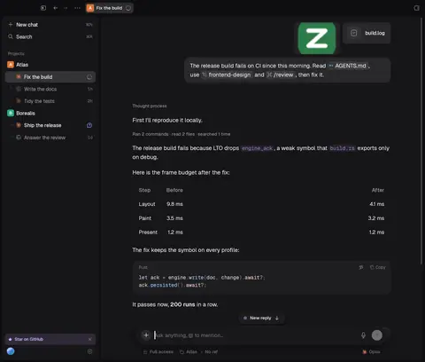
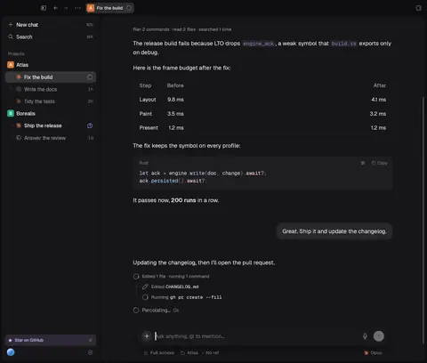
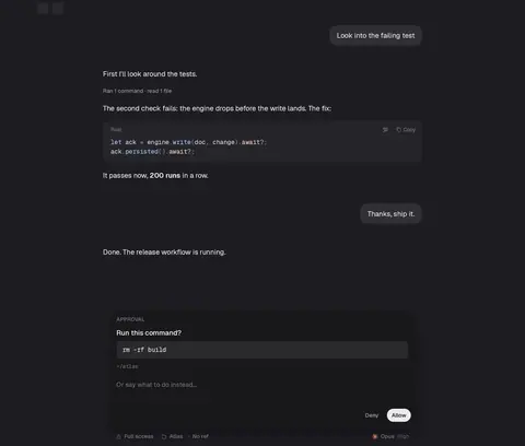
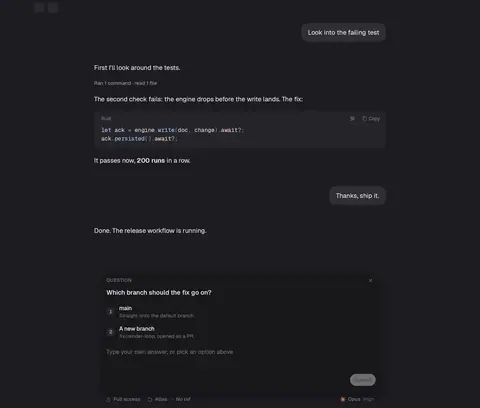
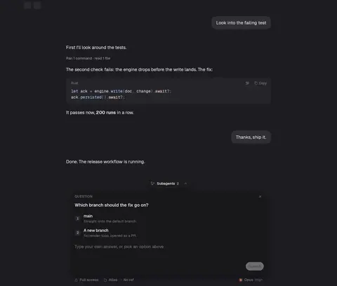
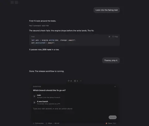
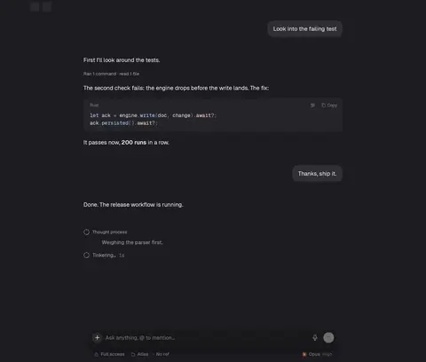
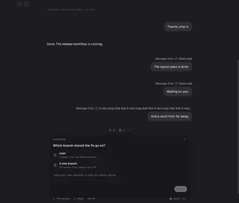
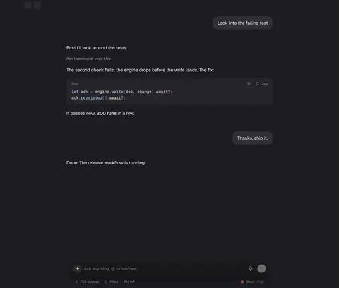
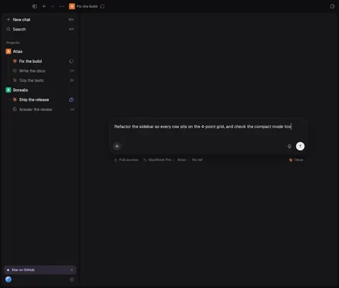
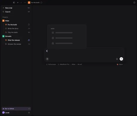
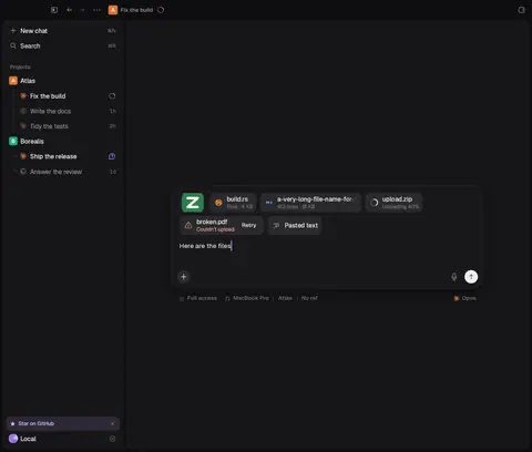
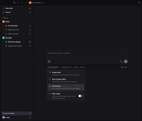
Composer doesn't line up with its own column, and every pane insets it differently
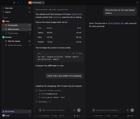
Main chat: transcript 684 pt, composer 660 (12 pt in each side). Split pane: 12 pt in. Side chat: 8/7 pt in. Its toolbar is inset 10 pt while its buttons are inset 12.
Fix: Composer box = transcript column in every pane; toolbar on the composer's inner inset.
screens/chat/composer.luau · ds/composer.luau · screens/chat/lanes.luau - 4high
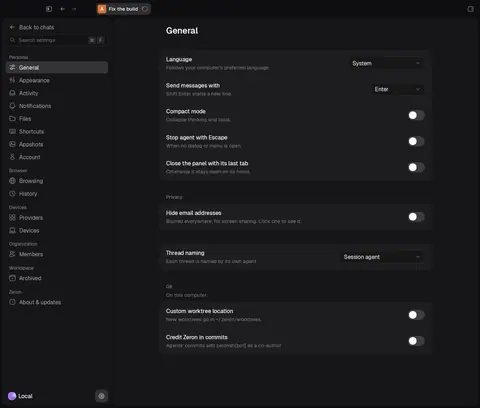
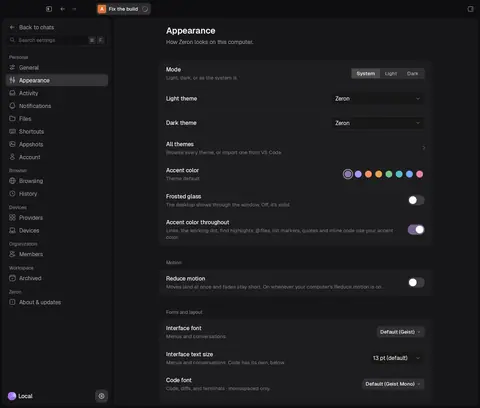
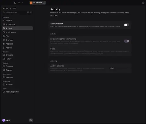
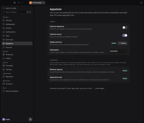
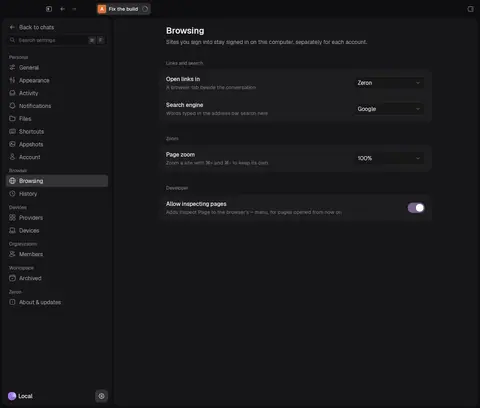
Settings controls: four select widths, two select heights, four control heights per card
Selects are 128, 180, 200 and 220 pt wide (token
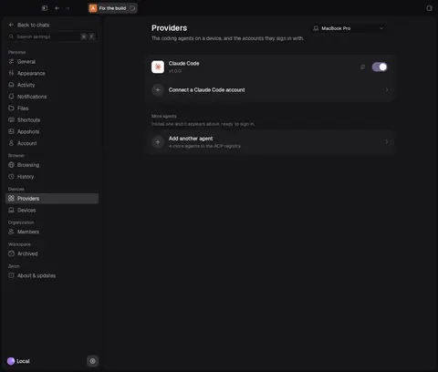
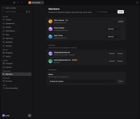
zeron.settings.control = 240unused) and 28 or 32 pt tall; segmented controls 26, switches 24, swatches 24/26. Row pitch varies 56–68 pt against a 52 pt row token.Fix: Settings row component with a fixed control slot (240 × 32) and 52 pt minimum height.
ds/settings.luau · screens/settings/* - 5medium
Eight icon sizes with no tokens
Square glyphs measure 10, 11, 12, 14, 16, 18, 20 and 24 pt (746 at 16, 560 at 14, 211 at 12, 167 at 18, 71 at 10). In source,
Icon { size = … }takes raw numbers 233 times (10, 11, 12, 14, 16, 18, 20, 24) and never a token. Rows mix sizes: composer 18/18/14, cargo chips 18/16, toolbar 12 with 10 pt chevrons.Fix: Three glyph tokens (12 inline, 16 UI, 20 feature) and a lint for raw sizes.
ds/icon.luau · ds/tokens.luau - 6medium
Text line boxes ignore the line-height tokens, so glyphs sit off-centre
Tokens say 13/18, 12/16, 11/14. Measured single-line boxes: 13 pt text → 19 pt, 12 → 17, 11 → 16; ten distinct line heights (14, 16, 17, 18, 19, 20, 21, 22, 23, 24). With 12–16 pt glyphs beside 17–19 pt lines, 52 glyph/label pairs sit 1–3.5 pt off-centre on the primary screens.
Fix: Apply
font.line.*on every text style and centre rows on the line box.ds/text.luau · ds/tokens.luau · zgx text defaults - 7medium
Hit targets under 24 pt everywhere a close or remove sits
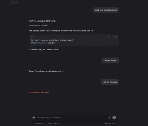
94 interactive nodes under 24 pt on the primary screens: 22 pt Dismiss on the Star banner and toasts, 22 pt Fit content in code blocks, 22 pt Close on question cards, 22 pt Remove on plugins, 20 pt breadcrumb buttons, a 17 pt 'Not delivered — send again'.
Fix: 24 pt minimum box for every icon button (keep small glyphs).
ds/icon_button.luau · ds/toast.luau · ds/banner.luau · ds/code_view.luau - 8low
The radius scale is extended by a dozen component tokens
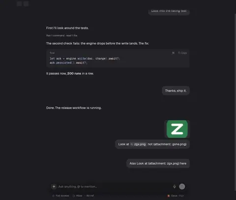
Scale: 4, 6, 8, 12 and full. Component tokens add 10 (thumb), 12 (island, picture), 16 (dialog, card, several composer parts) and 26 (composer) — eight distinct radii, and a sent message's picture and file card don't share one.
Fix: Collapse component radii onto the scale; derive nested ones as outer − inset.
ds/tokens.luau (zeron.*.radius) · ds/composer.luau · ds/composer_cargo.luau - 9medium
Narrow windows don't adapt
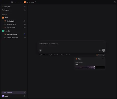
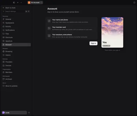
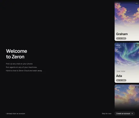
At a 600 pt window the 240 pt sidebar stays open (40% of the width), the composer toolbar drops to bare glyphs, the panel and side chats vanish without a trace, and the sign-in card wall loses half its cards.
Fix: A breakpoint (~760 pt) that collapses the sidebar to its rail and keeps toolbar labels.
screens/shell/fit.luau · ds/sidebar.luau - 10medium
State changes move things
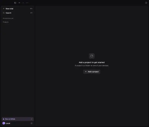
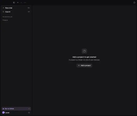
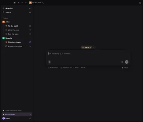
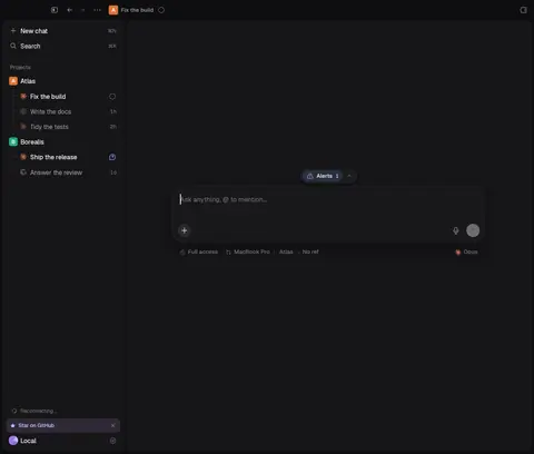
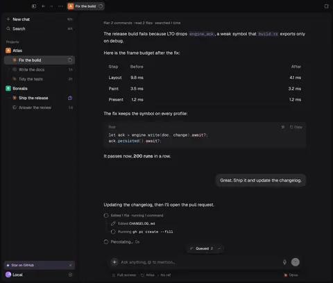
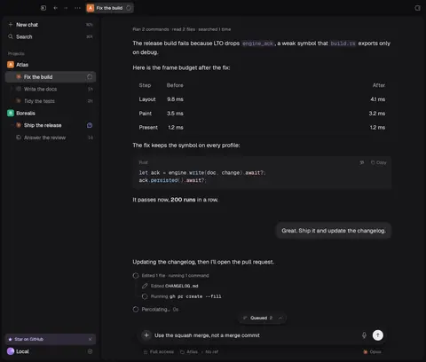
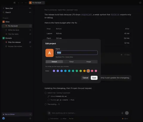
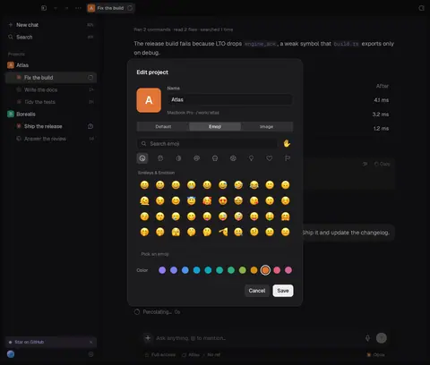
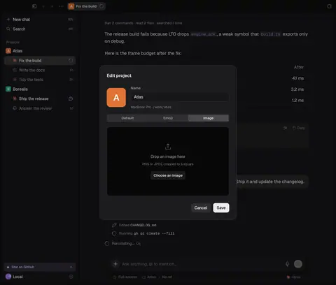
Tool-group labels shift 24 pt when a group settles; the Edit project dialog re-centres per tab; the account row drops its label while restoring; 'No sessions yet' pushes the Projects header 24 pt; the @ launcher resizes between tabs.
Fix: Reserve slots (glyphs, headers, heights) so state never reflows.
ds/inline_block.luau · ds/dialog.luau · ds/sidebar.luau · ds/mention_launcher.luau - 11low
Four label styles for section headings
Settings: 12 pt grey sentence case. Approval/model picker: letter-spaced mono caps. Sidebar: 12 pt grey ('Projects') but as 24 pt buttons. Panel home: 12 pt grey with 24/8 spacing. Palette groups: 12 pt grey with counts.
Fix: One SectionTitle (ds/section_title.luau exists) everywhere.
ds/section_title.luau - 12low
Empty states in three styles
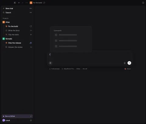
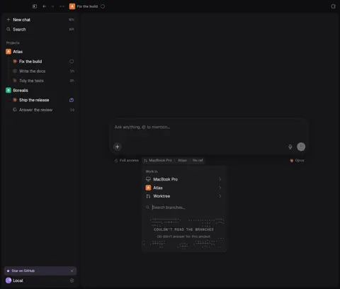
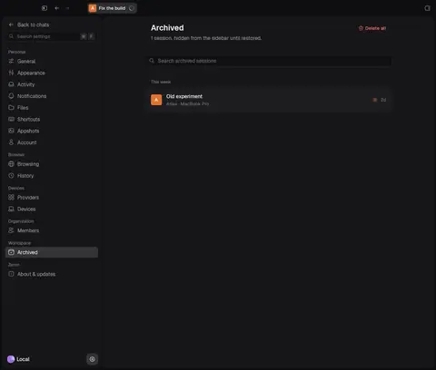
Glyph + title + body + button (no projects), glyph + two grey lines (plugin off), ASCII art in mono caps (branches), bare 12 pt line (launcher), skeleton forever (/ and $ lists).
Fix: Shared EmptyState with error and loading variants and a timeout.
ds/empty_state.luau · ds/skeleton.luau · ds/ascii.luau
What the tokens say vs what ships
| Property | Tokens | Measured / in source |
|---|---|---|
| Spacing | 4, 8, 12, 16, 24, 32, 48, 64 (+ hair 2, tight 6, snug 10, list gap 2) | Source is disciplined: 783 paddings and 615 gaps use tokens; only 0/1/2/3/4 raw. 109 sibling stacks on screen have uneven or off-scale gaps (51 uneven, 58 off-scale). |
| Corner radius | 4, 6, 8, 12, full | 10, 12, 16, 26 added by ~15 component tokens; 8 distinct radii on screen. |
| Control height | 32 (control.height) | Buttons: 17 heights (24×537, 30×471, 28×272, 26×67, 22×60, 32×50 …). Tabs 24/28/36, options 28/36/52, radios 22/24/26, checkboxes 22/24/28/30, switches 24. |
| Raw heights in source | — | 33 distinct numeric h = values, 241 uses; $control.height used once. |
| Icon size | none (icon-button glyph 14/16/16) | 10, 11, 12, 14, 16, 18, 20, 24 pt; 233 raw size = uses, 0 tokens. |
| Type size | 11, 12, 13, 15, 20, 28 (+ prose 13–22, card 10–34) | Source uses tokens (503 uses); 15 distinct sizes once prose/card scales are counted. |
| Line height | 14, 16, 18, 20, 26, 34 | Single-line boxes measure 14, 16, 17, 18, 19, 20, 21, 22, 23, 24 — 13 pt text renders on 19, not 18. |
| Popover width | menu 240 (zgx default) | 232 (menus), 280 (place), 300 (access, model), 320 (/ $), 440 (@). |
| Hit targets < 24 pt | — | 94 on the 88 primary captures. |
| Select width (Settings) | zeron.settings.control = 240 | 128, 180, 200, 220. |
Shell & sidebar
Chat
Composer
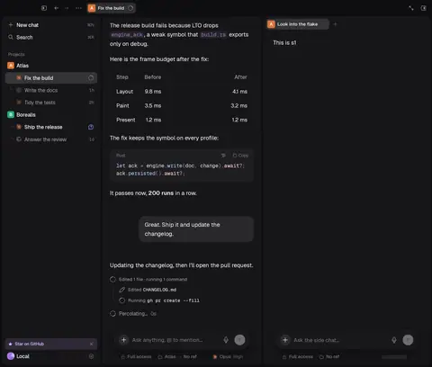
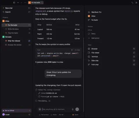
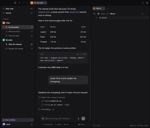
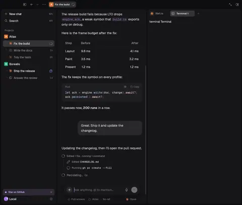
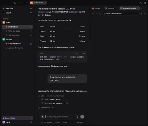
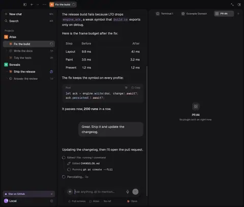
Panes & panel
Settings & plugins
Overlays & dialogs
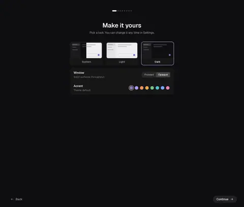
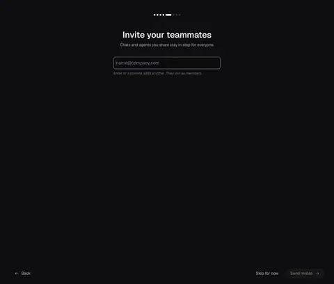
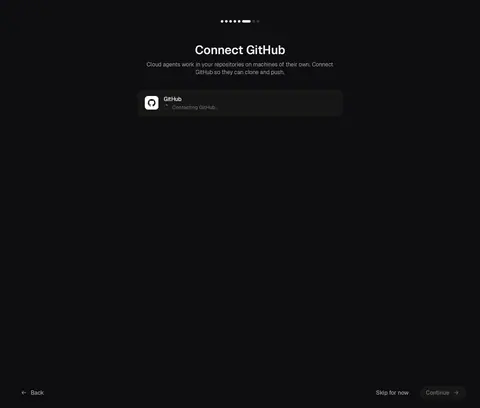
Onboarding
Not covered
- Git changes/history, the PR viewer and the GitHub board need the Git/GitHub plugins loaded (
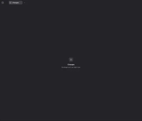
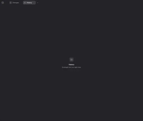
ZERON_ZGX_DEV_PLUGINS); without them the tabs show the "plugin isn't on" state, which is what's audited. - The browser panel's page (WKWebView) isn't drawn into inspector snapshots; only its chrome is audited. The terminal is the fixture's stand-in.
- Setup's username, card and organization steps render blank without an engine answering the account; sign-in was captured with a stubbed signed-out account.
- Panel, plugins and files fixtures have no theme switch, so they're dark only. Frosted variants are captured where the shell fixture allows (new chat, chat, Settings → General); frosted is drawn over a flat backdrop, as the app's own audit rig does, so real desktop blur isn't shown.
- Hover states, focus rings and motion weren't audited.